The clever design of these logos has made their brands become great commercial monsters and primary references for consumers. Perhaps the symbolism within their logos is what has benefited these marketing moguls, or simply their image that is curious and funny; Be that as it may, these designs will give you a whole new perspective, as we assure you that many of these secrets you did not know.
1. Hershey’s Kisses
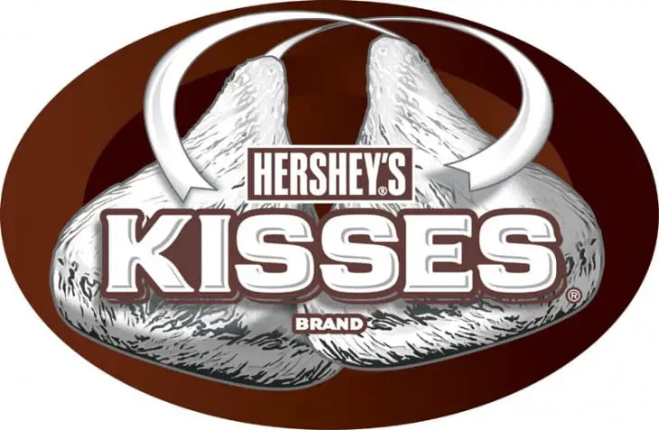
The space between the K and the I forms the silhouette of this famous chocolate.
2. Vaio
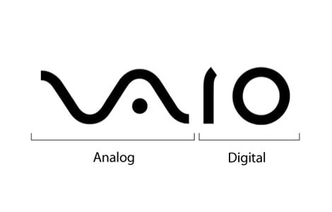
At first you’ll only see the word VAIO, but look a little closer and you’ll see that the first two letters represent an analog symbol and the last two letters are binary. A logo made for geeky buyers.
3. LG
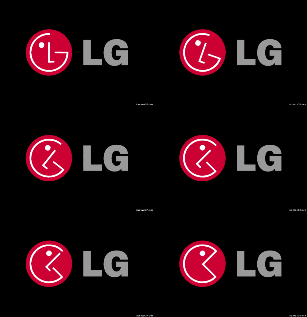
No, the similarity to Pac-Man is not confirmed; But it’s great all the same.
4. Mitsubishi
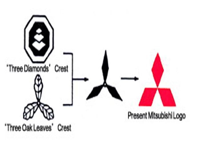
The Mitsubishi logo is steeped in history. It combines the three-leaf crest of the Tosa clan and the three-diamond crest of the Iwasaki family. The three diamonds represent reliability, integrity, and success. The word “Mitsubishi,” according to Penske Social, translates to three mitsu and “hishi” water chestnut, used in Japan to refer to a rhombus or diamond.
5. McDonald’s
Yes, the M is really nothing more than the initial for McDonald’s; There is no other meaning in this. In the 1960s, McDonald’s wanted to change its logo, but Louis Cheskin, the creator of the logo, insisted on leaving the golden arches. He said customers subconsciously recognize the logo as “symbolism of a pair of nourishing breasts.” Whether unconsciously, we created this or not, Cheskin convinced them and now the logo is one of the most recognizable in the world.
6. Amazon

The first image that comes to mind when we look at the Amazon logo is the arrow that looks like a smile. Now look at this arrow again and see that it starts at A and points to Z. This means that Amazon offers a wide variety of items for sale, literally from A to Z; And even more so if we take into account that it was originally an online bookstore.
7. Google
Have you noticed how the logo has four primary colors that break the tandem with others that are repeated? This was entirely intentional, as Google wanted to show that it doesn’t play by the rules but without making a bulky and complicated symbol; That’s why it uses free typography and colors.
8. Pepsi
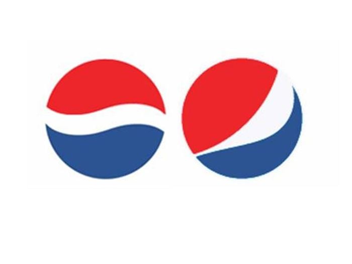
In 2008, Pepsi paid $1 million to Arnell Associates to create a new logo. As a result, Pepsi had to pay millions more to rebrand. Then, a document by Arnell called “Awesome Design Strategy” was leaked, showing that the new logo is a kind of Da Vinci Code, as it is based on Feng Shui, the Renaissance, geodynamics of the earth, the theory of relativity, the universe and many more things.
9. Unilever
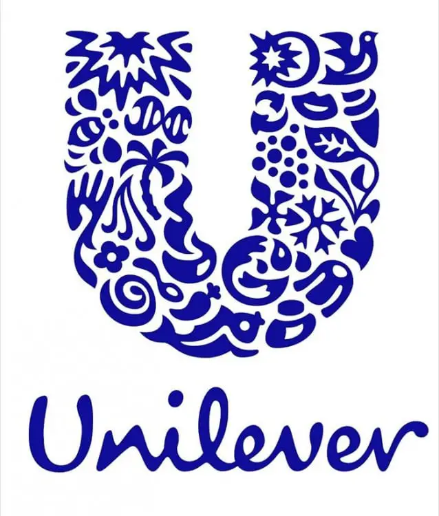
Unilever produces so many different products that it’s sometimes hard to keep track of them all. Luckily for us there are no symbols for everything they do inside in their logo.
10. Toyota

All the letters of the brand are inscribed on the logo.
11. BMW
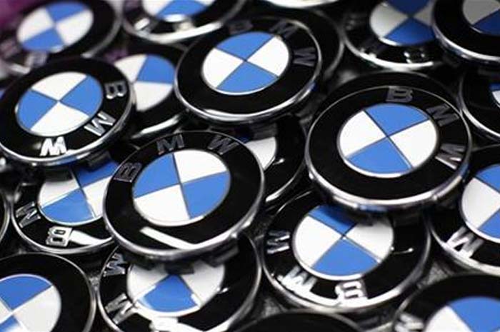
It has been associated with a blue sky and a spinning propeller dating back to the days of the creation of warship aircraft. But what if I told you it wasn’t the original intention? According to the New York Times, the trademark was registered in 1917, but the propeller association was not created until 1929, at an event in which the logo was displayed next to an airplane. Then? The blue and white colors represent those of the Free State of Bavaria. The reason was because the use of a national symbol in a trademark was illegal, so the colors were arranged in opposite order.
12. Coca-Cola
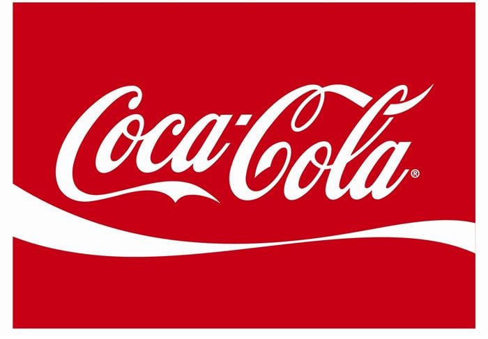
This logo has hundreds of interpretations around the world (from racist to anti-Islamic), however, the newest one alludes to the flag of Denmark. According to the Danes, their flag is hidden between the “O” and the “L” of the second word.
13. NBC
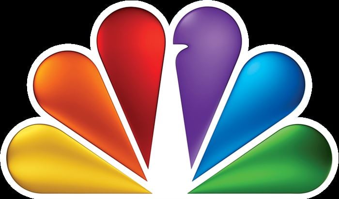
Yes, it’s a peacock, but have you ever wondered why it has so many colors? It’s because during the 1950’s the owner of NBC worked for RCA, who had begun manufacturing color televisions. RCA wanted people who were watching the black-and-white TVs to know what they were missing. So he created a colored logo.
14. Adidas
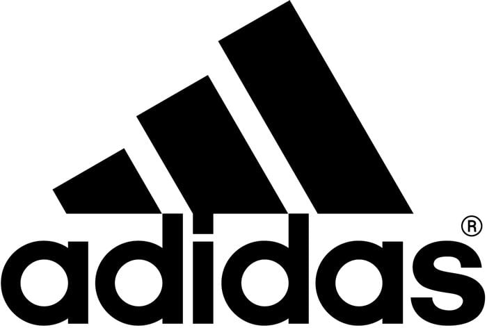
Initially it wasn’t 3 straight lines and it had no meaning whatsoever. But in 2006 a new version was made with the sloping lines simulating a mountain with steps. They alluded to the difficulties that human beings must go through in order to succeed.
15. Audi
Each of these rings represent the 4 founding companies of the Auto-Union Consortium in 1932: DKW, Horch, Wanderer and Audi.
16. Häagen-Dazs
Have you ever wondered what Häagen-Dazs means? Nothing, it doesn’t mean ANYTHING. Its creator Reuben Mattus invented the word to make it sound like “Danish”, even though it was really meaningless.
17. The Tour de France
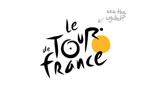
Made in a bespoke typeface, the Le Tour de France logo features a hidden cyclist formed by the letters “R” and “U”, riding a bicycle whose wheels are formed with the letter O and with the yellow circle, the color of the jersey given to the winner of the event. On a more subjective level, the yellow wheel also refers to the sun, as the event takes place in the summer.
18. FedEx
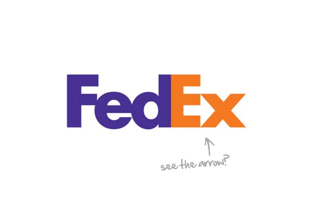
The design looks great, but the best part is that it’s conceptually tied to the essence of the business it represents. The arrow, according to the company’s leader, is a symbol of speed and accuracy, both FedEx values.
19. Apple

The apple represents the forbidden fruit of the “tree of knowledge,” while the “bite” represents a computer byte.
20. Continental Tires
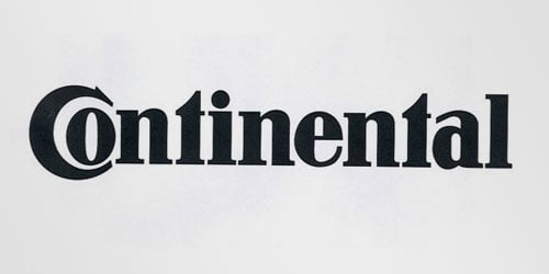
The letters “C” and “O” form a 3D tire.


Comments